
In the fast-paced world of e-commerce, a well-developed website is the foundation of your online store's success. With s...
In today’s digital age, having a website is no longer optional—it's essential for any business looking to survive and thrive. But the truth is, simply having a website isn't enough. Your website needs to be built with two crucial factors in mind: it must be SEO-optimized to rank higher on search engines, and it must be responsive to work seamlessly across different devices. Unfortunately, achieving both of these is a lot harder than it seems.
The Struggle with SEO
Search Engine Optimization (SEO) is a complex process involving numerous elements such as keyword research, meta tags, quality content, and backlinking. It’s not a one-time task, but an ongoing effort that requires constant updating and monitoring. And if your website isn’t properly optimized from the start, all your hard work could go unnoticed by potential customers.
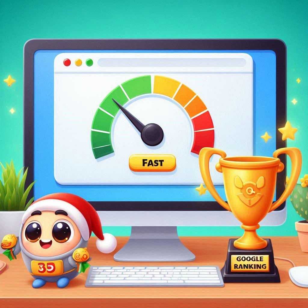
With search engines constantly changing their algorithms, keeping up with SEO trends is a challenge in itself. Many businesses struggle to get their websites ranked on the first page of Google simply because they haven’t implemented a solid SEO foundation. The result? Lower visibility, fewer clicks, and lost opportunities.
Why Responsiveness Matters
A responsive website is one that adapts to any screen size—whether it’s being viewed on a laptop, tablet, or mobile phone. In a world where mobile traffic now exceeds desktop, responsiveness isn’t just a feature; it’s a necessity. A website that isn't mobile-friendly will quickly frustrate users, leading them to leave your site for a competitor's.
However, creating a responsive website involves much more than just shrinking content to fit smaller screens. It requires careful planning, design adjustments, and proper coding to ensure every user, on every device, has the same seamless experience.
Why Getting Both Right is Hard
The combination of SEO optimization and responsive design is where many businesses stumble. The demands of SEO often require technical changes, while responsive design needs flexibility. Without expert help, achieving the perfect balance between the two can feel like a constant tug of war. Poor SEO will leave your site invisible, and poor responsiveness will drive away potential customers who do find you.
We’ve Got the Solution
At Help Me Instant Solutions, we know how difficult it is to create a website that ticks all the boxes: SEO, responsiveness, and user experience. We’re experts in developing websites that not only look great across all devices but also rank high on search engines.
Visit our website today and explore our range of products and services, from professional website development to digital marketing and SEO solutions. Let us take care of the heavy lifting so you can focus on what really matters—growing your business.
Don’t settle for a mediocre website. Get a proper SEO-optimized, responsive website that drives results. Check out Help Me Instant Solutions today and start seeing the difference.
In the fast-paced world of e-commerce, a well-developed website is the foundation of your online store's success. With s...

In today's digital age, having a robust online presence is vital for any business. A well-developed website not only ser...

In today’s digital landscape, where countless websites compete for users' attention, creating a user-friendly website is...
Website speed is more than just a technical detail—it’s a critical factor that can make or break your online presence. S...